
Preply `My Lessons` Redesign
UI/UX Case Study
Overview
Role: UX/UI designer
Scope: Self-guided Project
Duration: 2 weeks
Tools: Figma, Adobe Illustrator
This project is a case study on Preply, an online marketplace platform that allows learners to connect with teachers online, predominately for learning languages but has options to learn other subject areas. For this project, I did competitor analysis against three competitors, defined the user flow, created paper & digital wireframes, conducted usability testing, and created a high-fidelity prototype. This case study focuses on the "My Lessons" page and opportunities for improvement with the schedule view and ability to book more lessons.
Background
Preply is an online marketplace which connects learners with teachers located around the world, primarily to learn new languages but also gives learners access to instructors who teach other subjects such as programming languages, business classes, and sciences to name a few. Preply offers numerous filters and search options that allows users to narrowly search for instructors and uses an algorithm to match students with tutors. Preply's interface is clean and modern and has a lot of features to offer greater functionality to users such as calendars, in-app video support, a blackboard, chat messaging, and more.
Purpose
As a language learner, currently studying Spanish and previously Japanese, I love to use Preply to connect with tutors, however, I have difficulty understanding my upcoming lessons on the "My Lessons" page. Preply also has a system where you buy credits per instructor, instead of a pool of credits, however, the credits are pooled at the top of the screen and it difficult to understand how many credits I have left for each instructor. Lastly, I wanted to explore a way to make it easier to rebook canceled instructors. The objective of this cases study is to address these 3 pain points:
01
It's hard for me to tell when are my upcoming lessons
Schedule View
02
It is difficult to understand how many credits I have left for each instructor
Instructor Credits
03
Make it easier to rebook cancelled instructors from the "My Lessons" page
Book Instructors
Research & Ideation
Competitive Analysis
Competitive Analysis
I performed competitive analysis on 3 competitors: italki, DuoLingo, and Google Calendar. italki is the most direct competitor, offering a market place to connect students with tutors specifically for learning a new language. From DuoLingo I was able to draw insights from their UI, about how they keep it light and accessible. Google Calendar provided insight into some calendar scheduling features and design principles for calendar components.
I performed competitive analysis on 3 competitors: italki, DuoLingo, and Google Calendar. italki is the most direct competitor, offering a market place to connect students with tutors specifically for learning a new language. From DuoLingo I was able to draw insights from their UI, about how they keep it light and accessible. Google Calendar provided insight into some calendar scheduling features and design principles for calendar components.
italki
While italki does offer similar functionality as Preply, on their 'My Classes' page, users have the flexibility filter by instructor, class, subject, and package lesson, making it easier for students to find lessons and teachers especially if they have had multiple teachers across different languages. They also make it easy to rebook lessons with a teacher a user has already had a lesson with by providing a button that appears on hover of the list item card. The calendar view was not directly accessible from the list view, but it did color code lessons by whether it was upcoming, completed, etc., which may or not be useful for users to quickly understand their schedule.
DouLingo
DuoLingo is known for their gamified learning platform where users interact with quizzes and memorization games to learn vocabulary and grammar, however, DuoLingo also has a section with in the app that is a market place that allows students to look for classes or language learning events where students can speak with other language learners. The 'Attending' page which shows a list of events the user is going to is quite similar to Preply where they show a list of upcoming events in card form.
Google Calendar
Google Calendar is one of the leading apps providing a calendar feature and allows integration with many websites including Preply and italki to manage schedules. Some key take-aways after analyzing Google calendars is the flexibility they offer in terms of filters, as well as alternate date and time views. Finally the ability to integrate multiple calendars and events into one calendar makes Google Calendar an easy collective place for managing schedules.
User Flow
Based on the 3 pain points, I decided to focus on the following 3 areas for improvement:
-
Making calendar view the default view, with option to change to list view
-
Making it easier to see how many classes you have left with upcoming lessons for each instructor
-
Making it possible to quickly book more lessons with a previously cancelled instructor
Below is a user flow showing how users will navigate to the "My Lessons" page, check their schedule, and decide whether to rebook a previously cancelled teacher or navigate to the find new teachers page to find new instructors. The flow also briefly touches on how the user might interact with setting goals through the platform but the design for this is not covered in this case study.

Wireframes
The following digital wireframes are based on ideation through paper wireframes and include the calendar view as the default view when the user goes to the 'My Lessons' page, lesson and instructor filters, 'Book More' button, and more visibility on how many lessons a students has with each instructor.

Usability
Using Maze, I created a usability test to test how easy the filters were to use and also to test the booking work flow for specific past instructors.

Task 1:
Use the “Teachers” filter to only show your schedule for Fernando?
Findings:
100% of participants were able to complete the task with 71% find the filters easy to use, and 29% finding it moderately easy to use.
No changes were made to filters based on results from usability test.
Task 2:
Findings:


29% of respondents were unable to complete the task, 58% found the task difficult, while 43% of respondents found the task relatively easy.
Book 4 lessons with Fernando and complete booking; go back to dashboard after completing booking
Based on responses from task 2, it was clear that many respondents found the task difficult which led me to design simpler options and provide more labeling. Also, it is worth noting that not all the elements on this low-fidelity mockup had interaction behaviors which many respondents mentioned made it difficult to complete the task. For future usability studies, all elements should be interactive as they would be in a real app or perhaps I should ask more specific questions to complete the task.
Design
Based on the results on the usability study and the core user pain points, I focused on creating an app that addressed the issues of the pain points and also streamlined the interactions a bit more. In terms of design, I decided to keep the Preply brand colors and keep the UI light and fun, using softer rounded typography and elements.
Style Guide


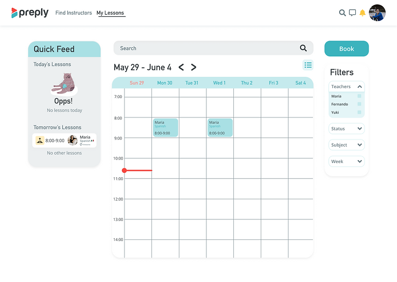
Calendar View
To align with users established understanding of using paper and digital calendars and agendas for scheduling events and appointments, I made the default view for upcoming and past lessons the calendar view with the option to switch to the list view.


Remaining lessons with instructors
To help increase visibility of how many lessons a student has left with an instructor, each card under 'Upcoming Lessons' on the schedule list view has additional information about lessons remaining. If only 1 lesson is remaining for an instructor, content will be marked in orange.


Book lessons with canceled instructors
Preply has a subscription payment model for purchasing lessons with instructors, so when a student runs out of lessons, lessons will be automatically topped up until a student decides to cancel. For canceled instructors, currently students have to book by going to the instructor's page or a master button on the page, however, to increase accessibility and reduce time to reinstate classes, I'm proposing adding a 'Book more' lessons button to the canceled instructor's cards.

Final Solution
In the final solutions, the 'My Lessons' page has been redesigned to include the following functionalities and workflows:
-
Calendar view as default view with option to switch to schedule list view
-
Filters to give greater flexibility to users
-
Information about lessons remaining for each instructor
-
'Book more' lessons button added for instructors that were canceled
-
Quick booking options to reserve a previous recurring lesson schedule with canceled instructors (if schedule is still available)
-
Option for users to put a new lesson schedule with canceled instructors
Figma file can be accessed from here

Key Frames
Next Steps
I would like to conduct a usability study on the hi-fidelity designs and also would like to consider the following areas for design.
-
Considering alternative layouts for instant booking recurring lessons, especially the recurring schedule component
-
Adding more functionality to the calendar view
-
Improving the interaction and variable states of some of the components in the style guide such as buttons, checkboxes, etc.
-
Settings goals and objectives workflow
-
Reviewing the cancelation workflow